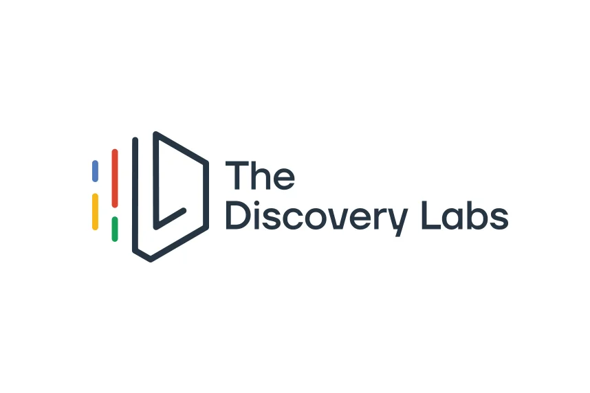
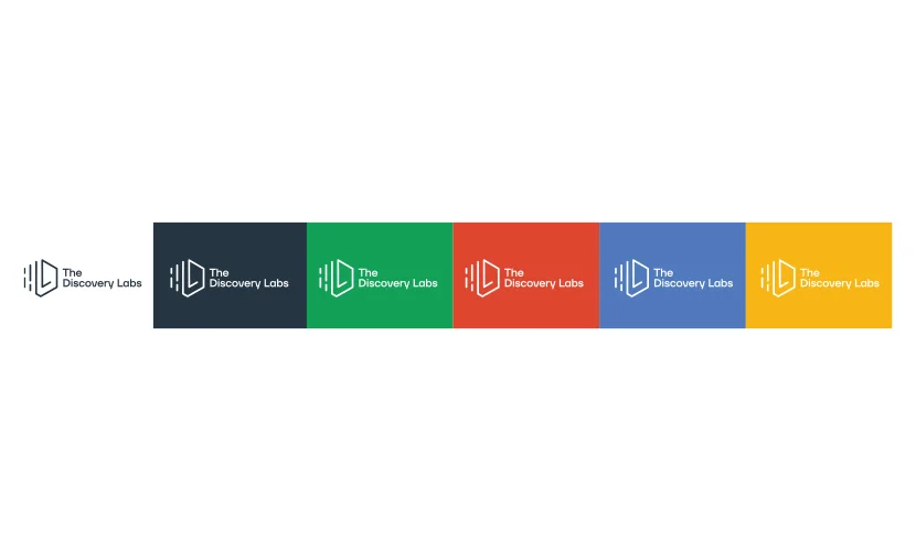
THE DISCOVERY LABS
BRAND IDENTITY DESIGN // AGENCY WORK // MUHLENHAUPT + COMPANY // 2019
the challenge
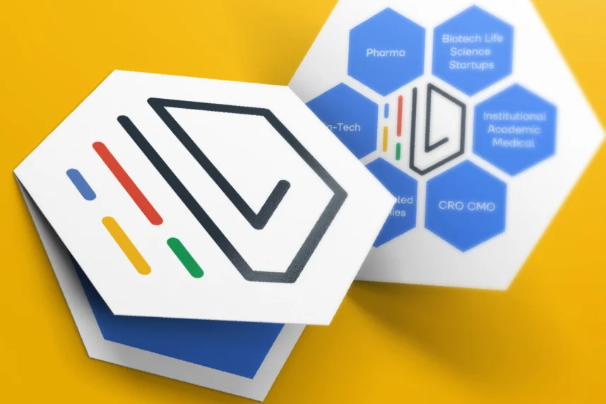
MLP Ventures is developing a $500 million healthcare, life science and technology co-working community in King of Prussia, PA. This campus, known as “The Discovery Labs” is the world’s largest cGMP manufacturing, turnkey laboratory solutions, and office space designed to support therapeutic products and services to the biotechnology and pharmaceutical industry. In addition to branding the operating company, there are two other entities that need to fit under the visual brand identity, “Unite IQ” and “The Center for Breakthrough Medicines”.
The approach
Cell and gene therapy has grown exponentially in the Philadelphia area, so much that it has now been referred to as the “Cellicon Valley”. When creating the brand identity, we had to tie it back to our scientific roots, while still displaying the integration of technology in our campus with a modern identity. The three brand identities were heavily influenced by DNA strands, molecular forms, hexagons and common cell and gene therapy processes.
The Results
The Discovery Labs received an enormous amount of press from multiple news outlets when the brand was announced at BIO 2019. It was referred to as one of “the largest real estate deals of 2019” by multiple news outlets. Our branding efforts led to partnerships and investments from the Pennsylvania Biotechnology Center and Deerfield healthcare management. A consistent brand identity system allowed for The Discovery Labs team to develop a market presence in an unoccupied space. The Discovery Labs KOP campus is still under development.
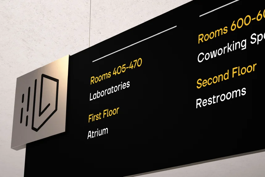
The mood board draws inspiration from a wide variety of things between science and nature. The idea of the hexagon became apparent through molecular forms. The hexagon is also one of the most efficient, least wasteful shapes in nature (think of a beehive). The overall color palette was inspired by colors of base pairs within DNA. When branding a co working space, it’s important to tie in the logo mark into the office space, which is why I sourced lights, sleep pods and dining areas in the shape of hexagons to keep a consistent brand within the physical space.
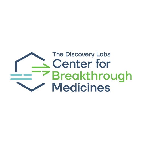
The Center for Breakthrough Medicines is a seamless multi-point tech transfer facility, enabling your research to safely transition in to our CDMO without risk or compromise.
The mark itself draws from CAR-T cell therapy processes. An arrow was added onto the end of the cells to represent “breakthrough”.
Unite IQ provides research and development laboratories, shared equipment resources, on-site supplies, grant writing and submission services, business planning, and a showcase for financial capital providers associated with The Discovery Labs.
The mark utilizes the same form for The Discovery Labs overarching brand, although the right side was modified to form a Q.
Getting external stakeholders buy-in on deliverables was a large bottleneck as we were always getting caught up in minor details, delaying processes.
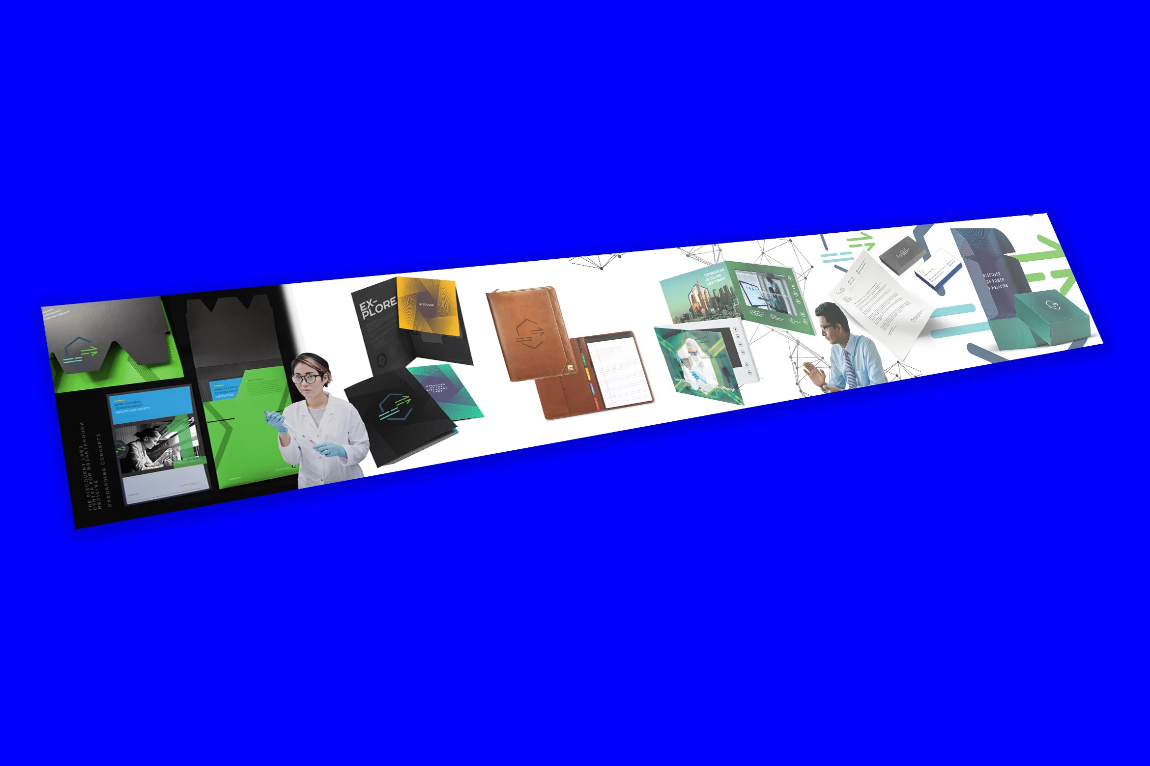
After identifying this as an on-going problem, I created a “stylescape” for the new hire onboarding materials. We brought a large 40” print out showing all the materials together at once, juxtaposed with our target audience and graphical elements. Our team got immediate buy-in and the client was thrilled to see how the system worked all together. Since this new-hire project, we have implemented the use of stylescapes in branding projects across a variety of different clients moving forward.

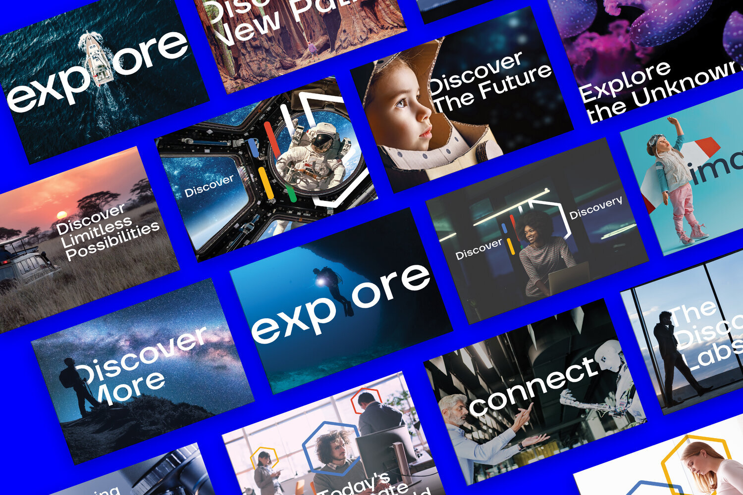
We put together a large brand hero imagery book compiled of different styles to be applied across a variety of materials both print and web.
We compiled a large booklet of aspirational hero imagery that could be applied across a variety of print and digital assets.
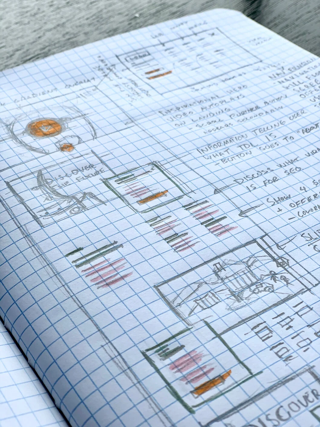
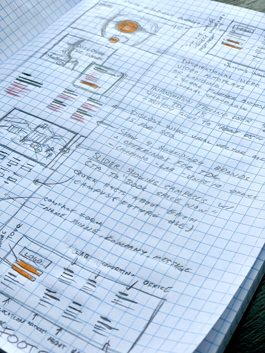
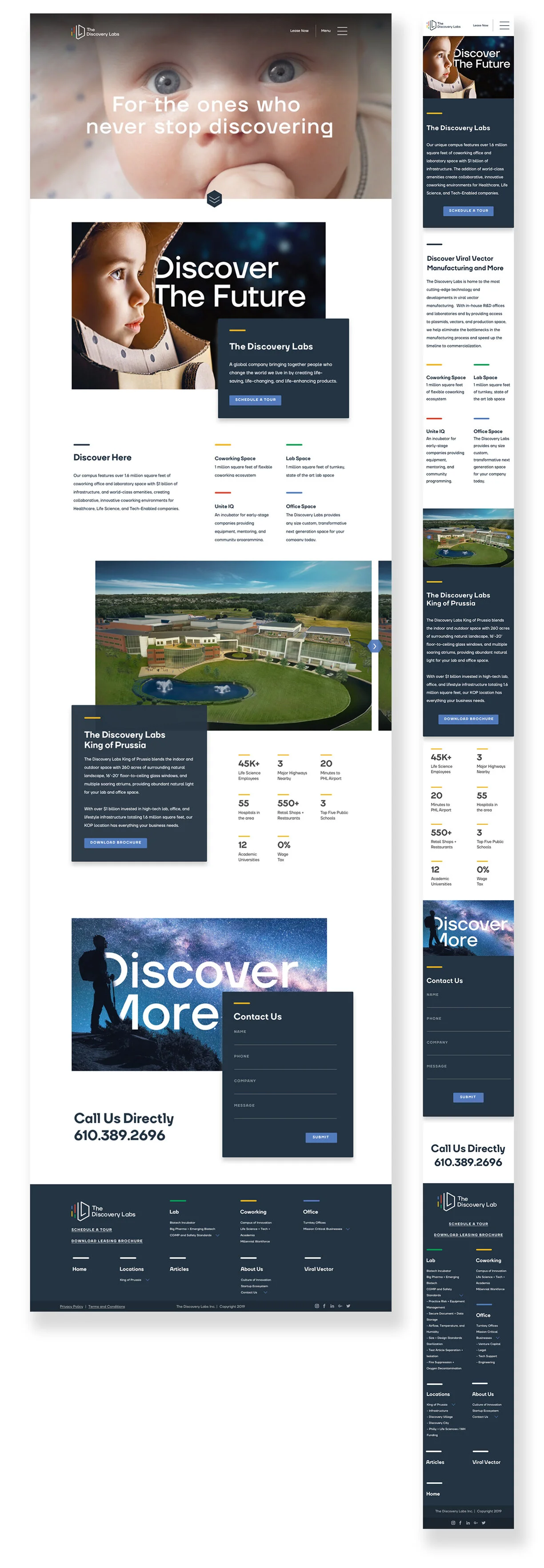
When constructing the website, we wanted to ensure that we were using some of the aspirational imagery to grab the user’s attention. Subtle nodes tie back to the brand in terms of the horizontal bars placed above the clean, well-formatted typography to display the necessary information to our target audiences.