
MEDICAL GUARDIAN
ILLUSTRATION // UI/UX DESIGN // EMAIL DESIGN // AGENCY WORK // MUHLENHAUPT + COMPANY // 2019
the challenge
Medical Guardian is a one-stop provider of medical alert solutions, dedicated to helping people take the next chapter of their life head-on. Our relationship with Medical Guardian was on a monthly retainer basis, so the work was always fresh and exciting. I was primarily responsible for illustrations, email design, and UI/UX design of interactive modules found throughout the site.
The approach
When creating assets for Medical Guardian it was important to keep in mind their target audience. There were two primary audiences that we identified. An older generation ranging in age from 55-70+ looking for a product that will keep them safe and a younger generation ranging from 20-35+ looking for a device that will keep their loved one safe.
With this in mind it was incredibly important to increase type size and leading when designing brand assets. When approaching illustrations for the various interactive modules, I wanted to ensure that the pictures helped relate back to the questions in a way that was not only visually appealing, but helpful for our target audience.
The Results
Our efforts in using the illustrations and designing the interactive modules increased traffic to the Product Chooser Module the Risk Assessment modules. The new email designs and content used in the campaigns increased overall clickthrough rate by 20%.
Product Chooser Work
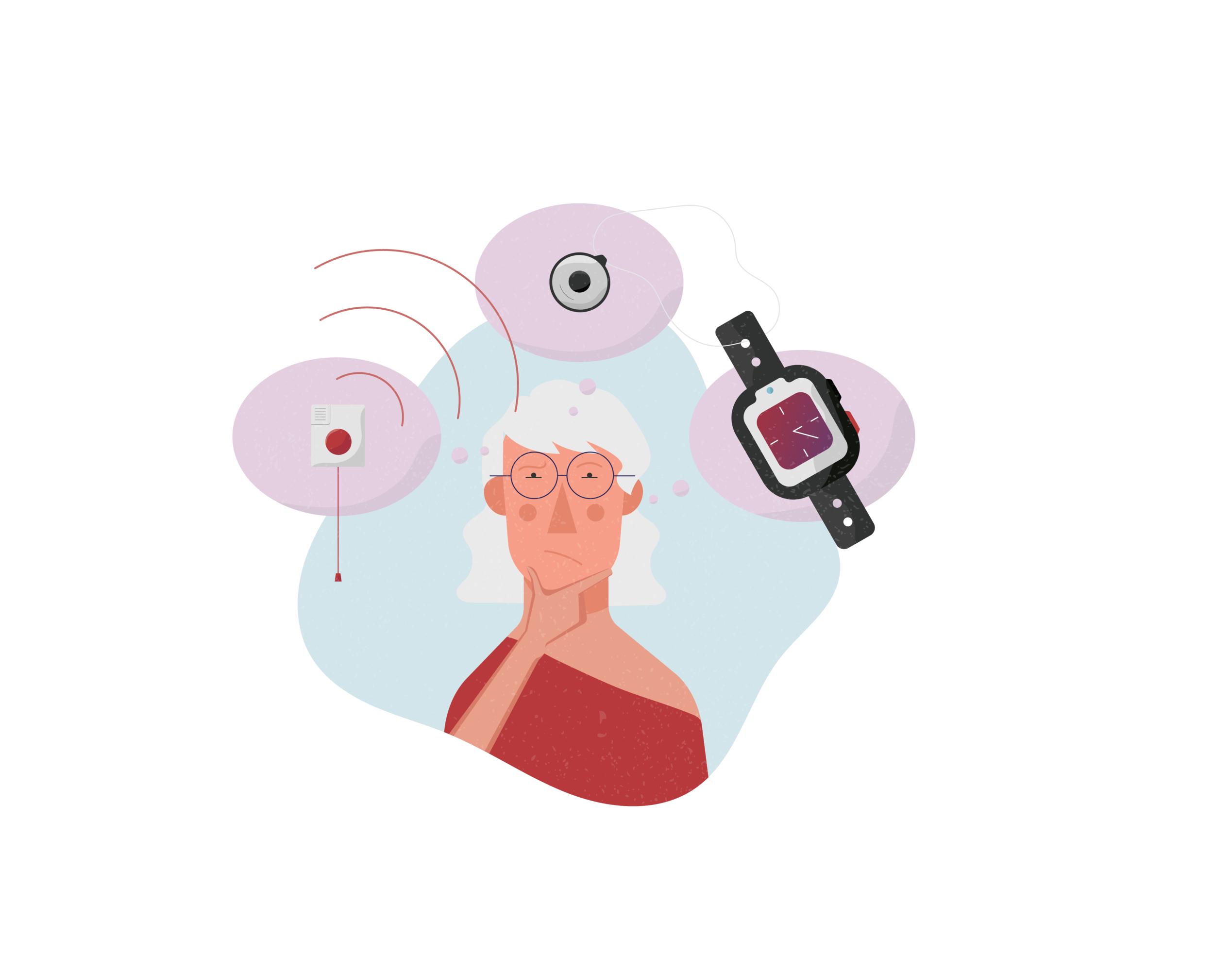
The illustrations below were created to correspond with the questions within Medical Guardian’s product chooser module.
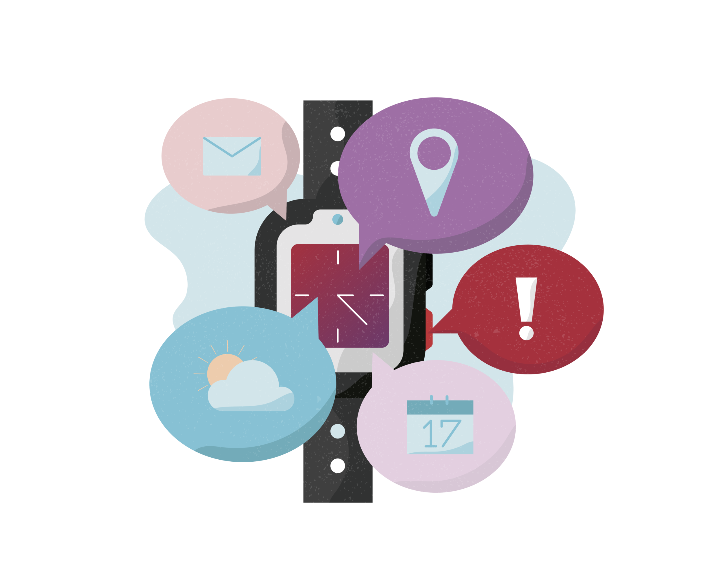
Would you like to use your device to keep track of your schedule, location, SMS messages, and weather forecast?
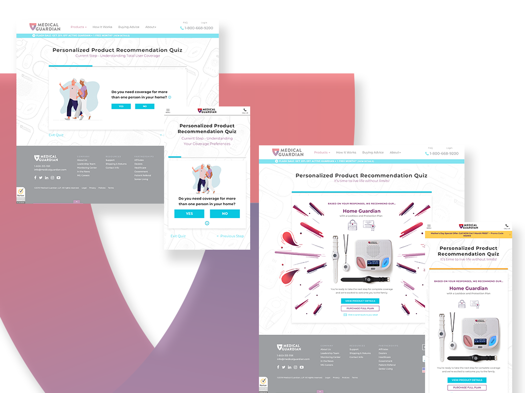
The illustrations were paired with questions and laid out in an interactive module on their site to help guide users to find the product that is the best fit for their needs.
User’s who took the product chooser quiz were then segmented into the email funnel. The funnel would first follow up with their recommended product. After this, it would send them follow up emails crafted around some of their responses throughout the quiz that would deal with uncertainties they may have around the product. The next email in the drip was to educate the at risk or their loved ones on the facts about falling and statistics around it. Finally, the last email was a product offer email that engaged them to go and complete the purchase of their selected device.
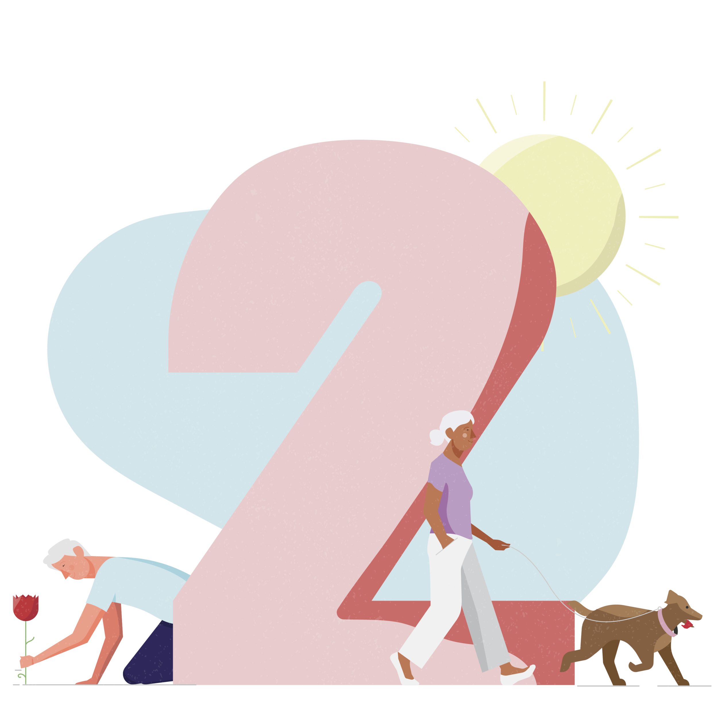
Risk Assessment Work
LOW RISK
MEDIUM RISK
HIGH RISK
User’s were split into three different categories. Low, medium, and high risk. To differentiate the different personas, I used a blend of color, weather, daily activities they might be doing and objects that impose danger to quickly represent and relate to the types of people that fall under these groups.
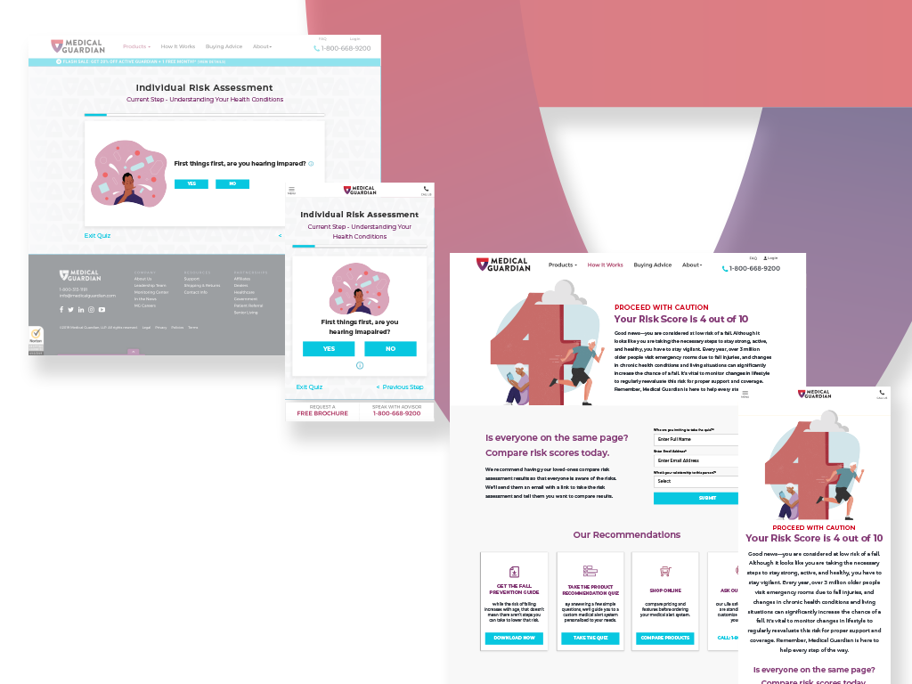
The numbers were used on a landing page to give user’s their score upon completion of the Risk Assessment.
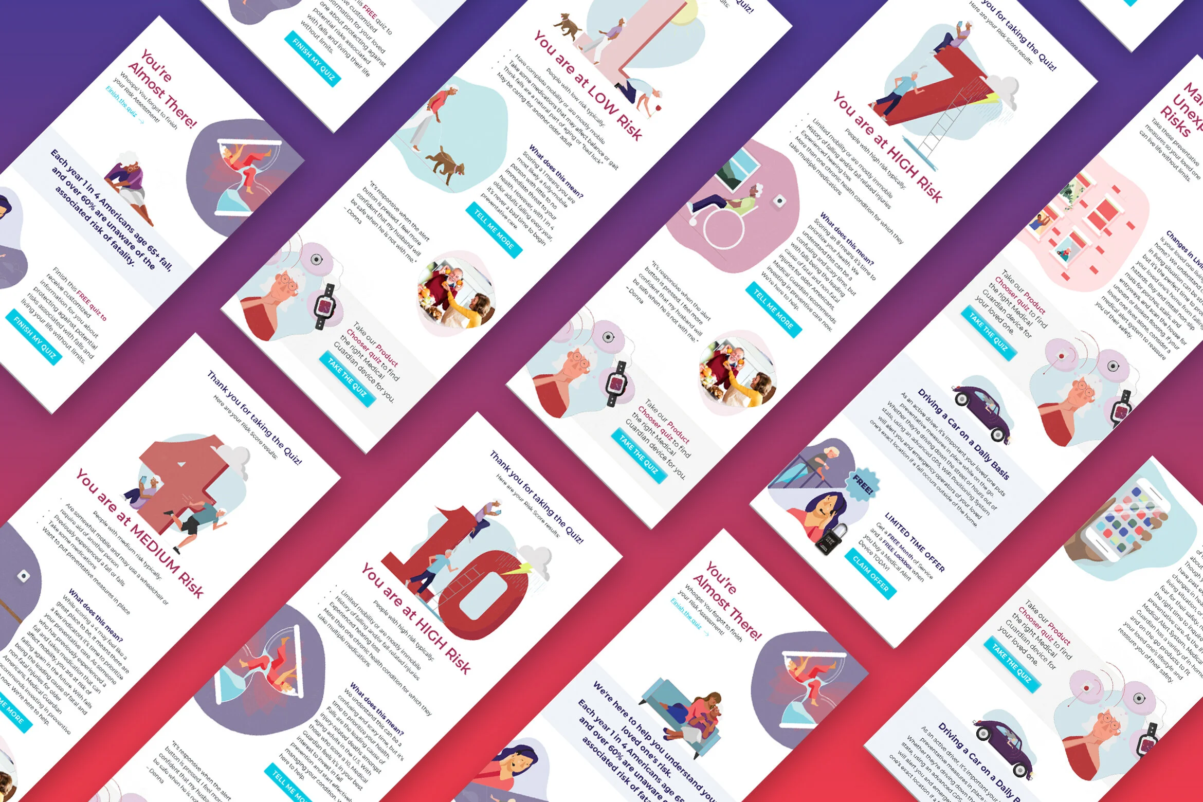
The Risk Assessment Illustrations were applied onto emails and sent out to the two audiences (loved one vs. myself) based on their responses to questions in the modules.